All of my greeting card images fill the 5×7″ picture frame entirely. It’s as if you’re inside a house, looking out through a window. You intuitively know there’s more to the landscape than just the small part that’s visible from where you’re standing.
In order to achieve this effect, I deliberately construct more imagery than I need. Create a big canvas, frame a smaller section. Below, have a look at what lies outside the picture frame for this year’s cards.
(Click on images to see extra-large versions!)
1. Public Access Xanadu: 1980 Timeslip Broadcast
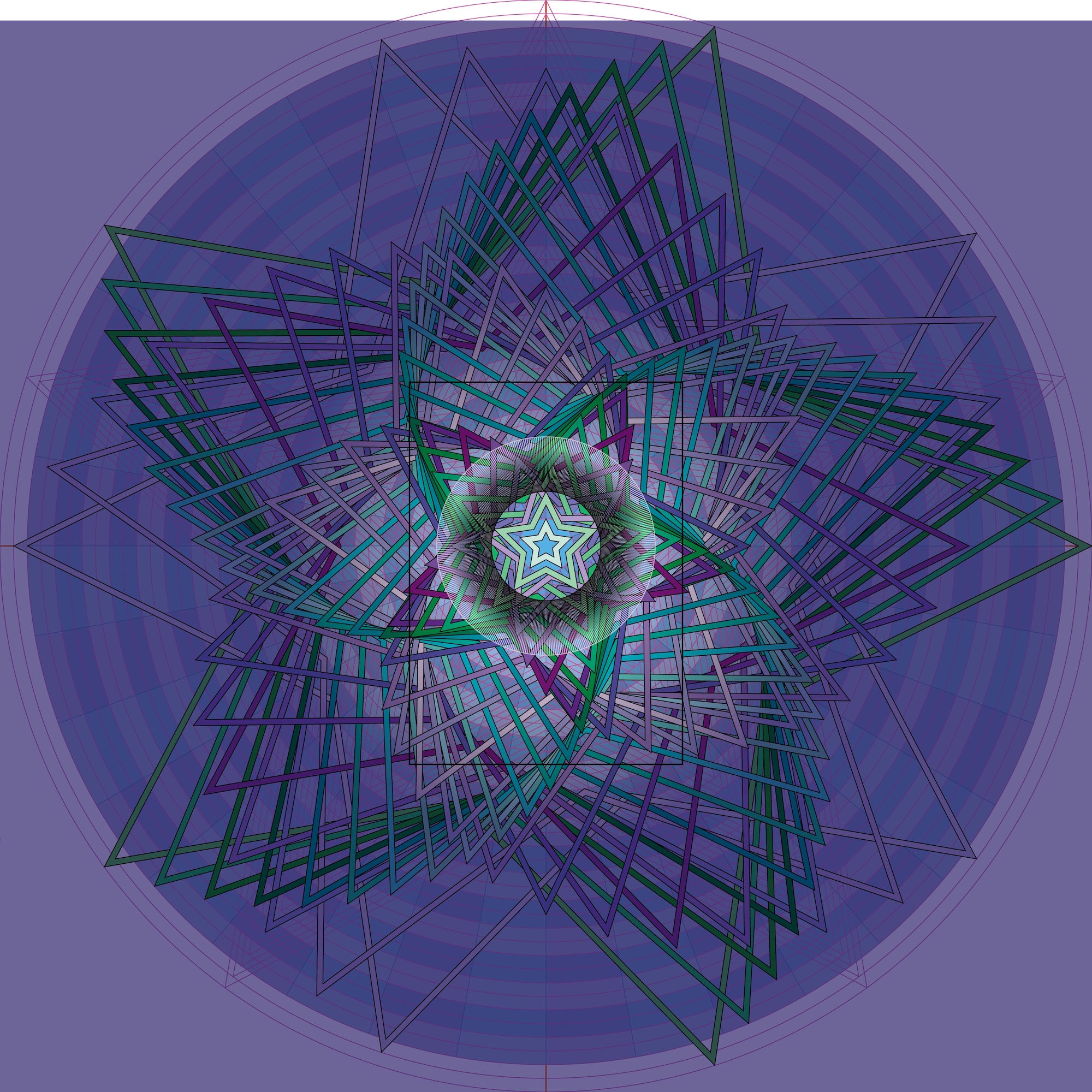
2. Underneath Xanadu (“Tanglestar” Prototype)
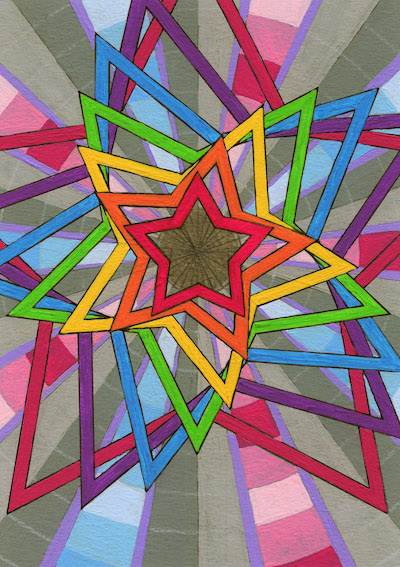
3. Illustrator Improv (Untitled)
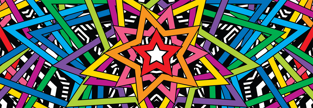
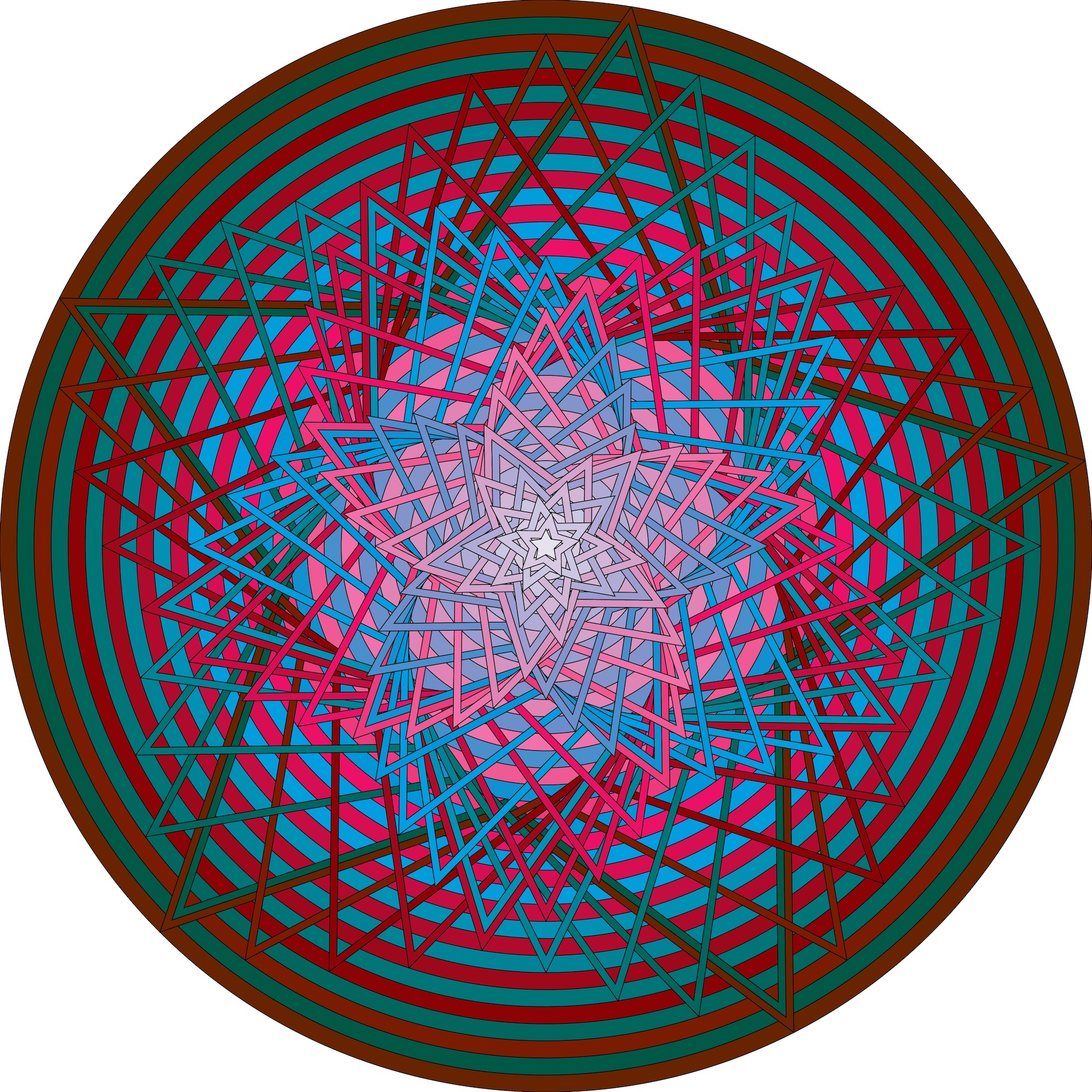
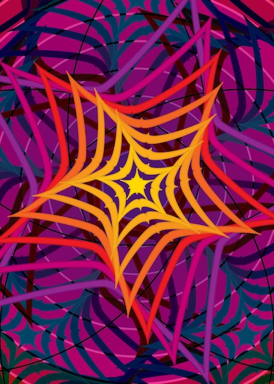
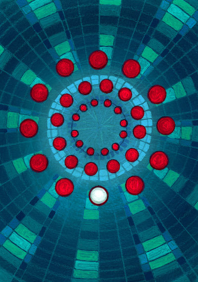
4. Winter Tanglestar
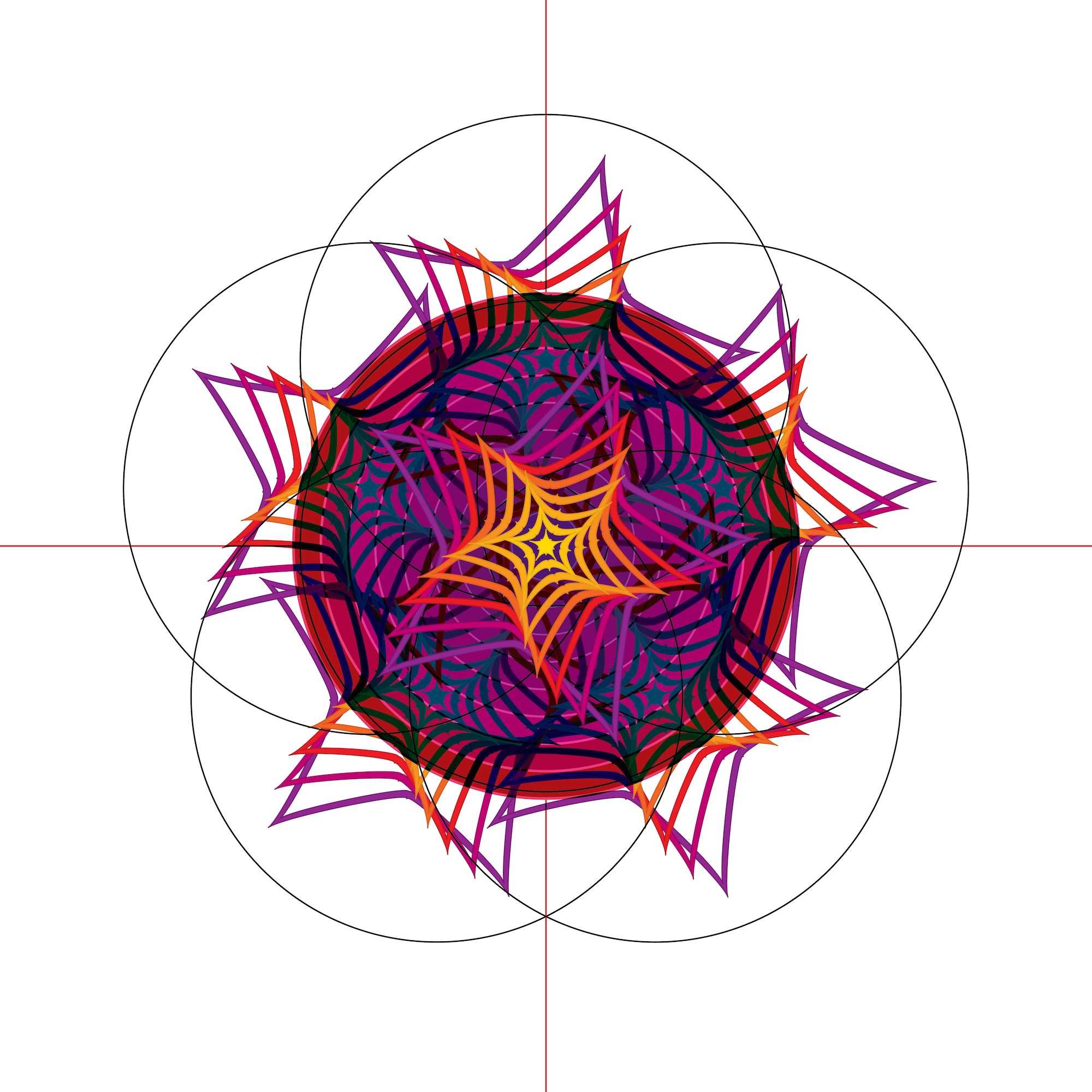
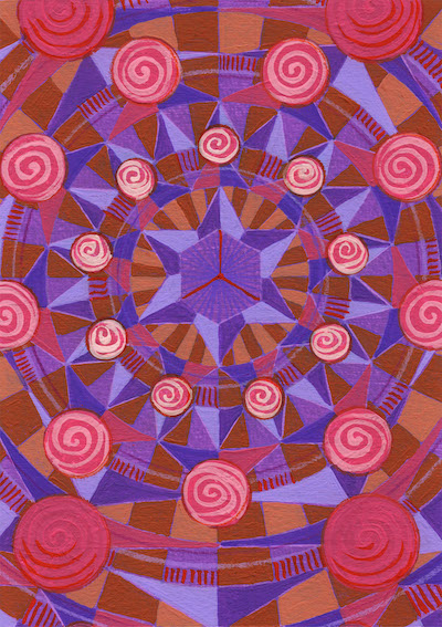
5. Bramble Star Fever Flowers
6. Nonbinary Star System
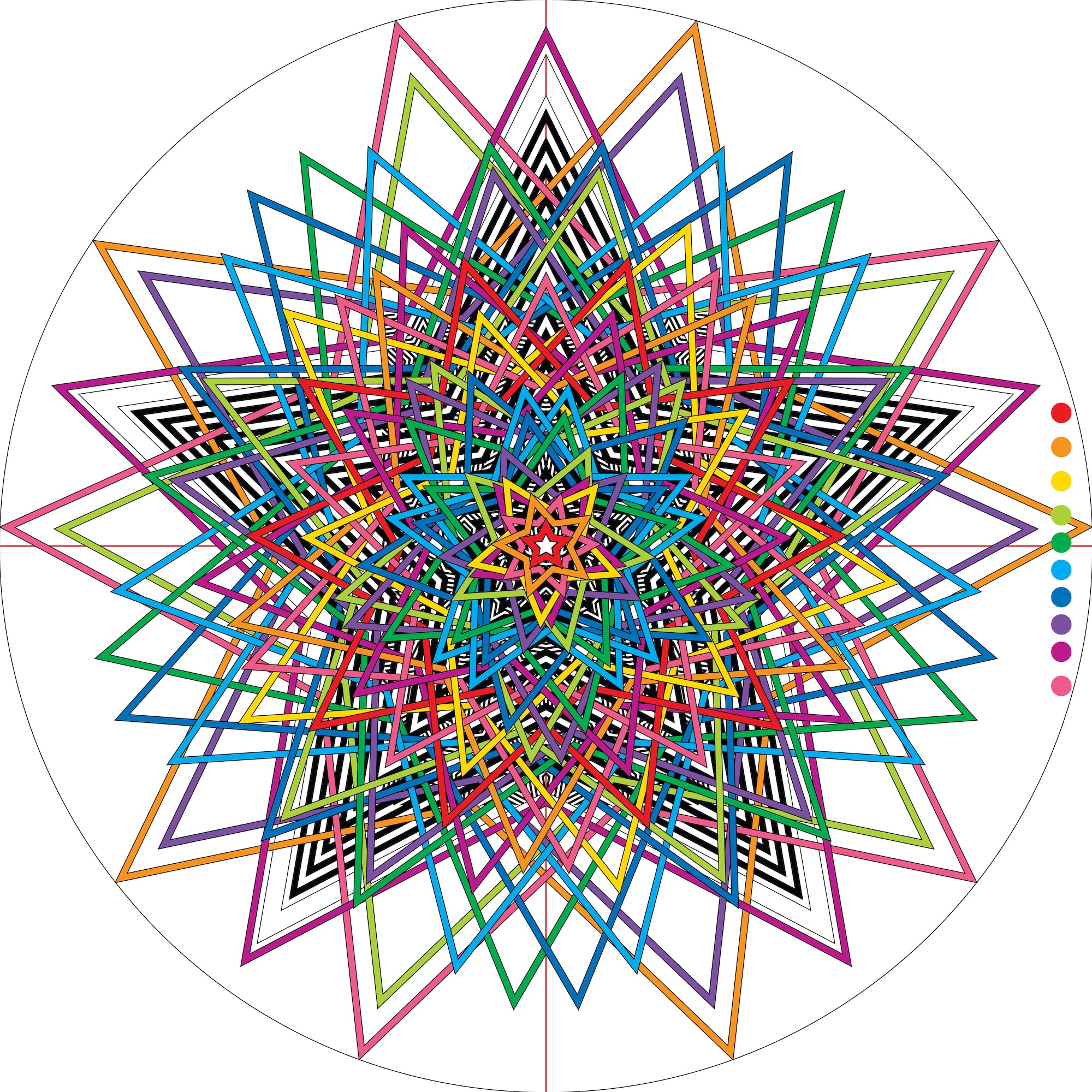
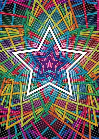
7. And All Around Me, My Garden of Stars
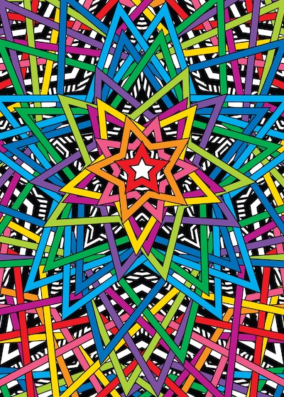
8. Rainbow Zebra Tanglestar
Building more imagery than I need leads to a very interesting possibility. I have the option to reframe my artwork. The frame doesn’t have to be 5×7. Instead, for instance, I could select an area with a 16:9 aspect ratio. That’s the frame shape we currently associate with television and cinema.
9. Reframing with 16:9 Aspect Ratio
For years, I’ve wondered what my greeting cards would look like if they were translated into animation. By reframing this year’s designs to 16:9, I now have concept art that shows me much more clearly what animated versions might look like.
The fact that I made this year’s cards using vector art is also important. Regardless of what frame I use, animation made using acrylic paints would be extremely labor-intensive. But having begun in Adobe Illustrator, I can now import the shapes that I’ve constructed directly into Adobe After Effects.
The leap from concept art to animation suddenly looks very small indeed.
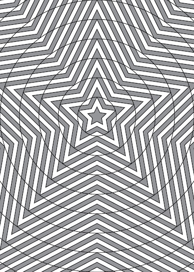
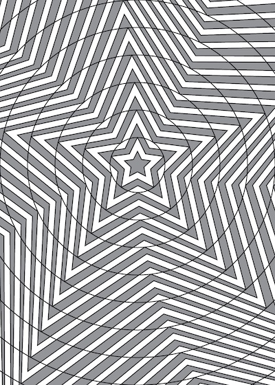
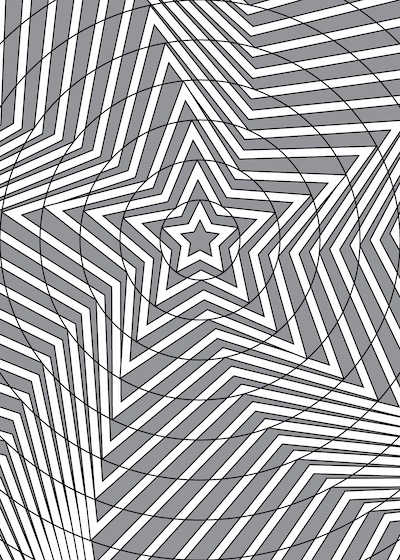
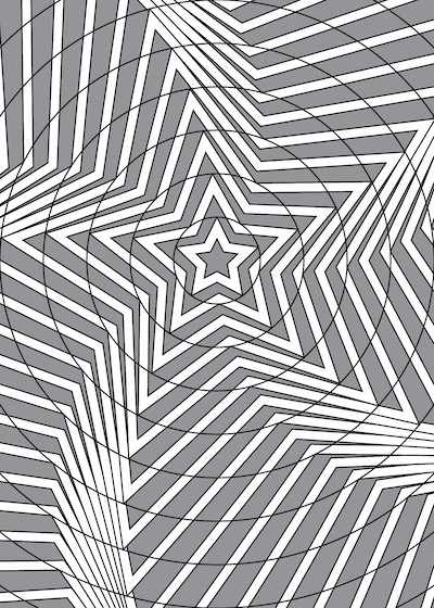
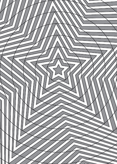
A visual theme emerged organically while creating greeting cards for 2023. All the designs feature overlapping spirals of five-pointed stars, which I’ve dubbed “tanglestars.”
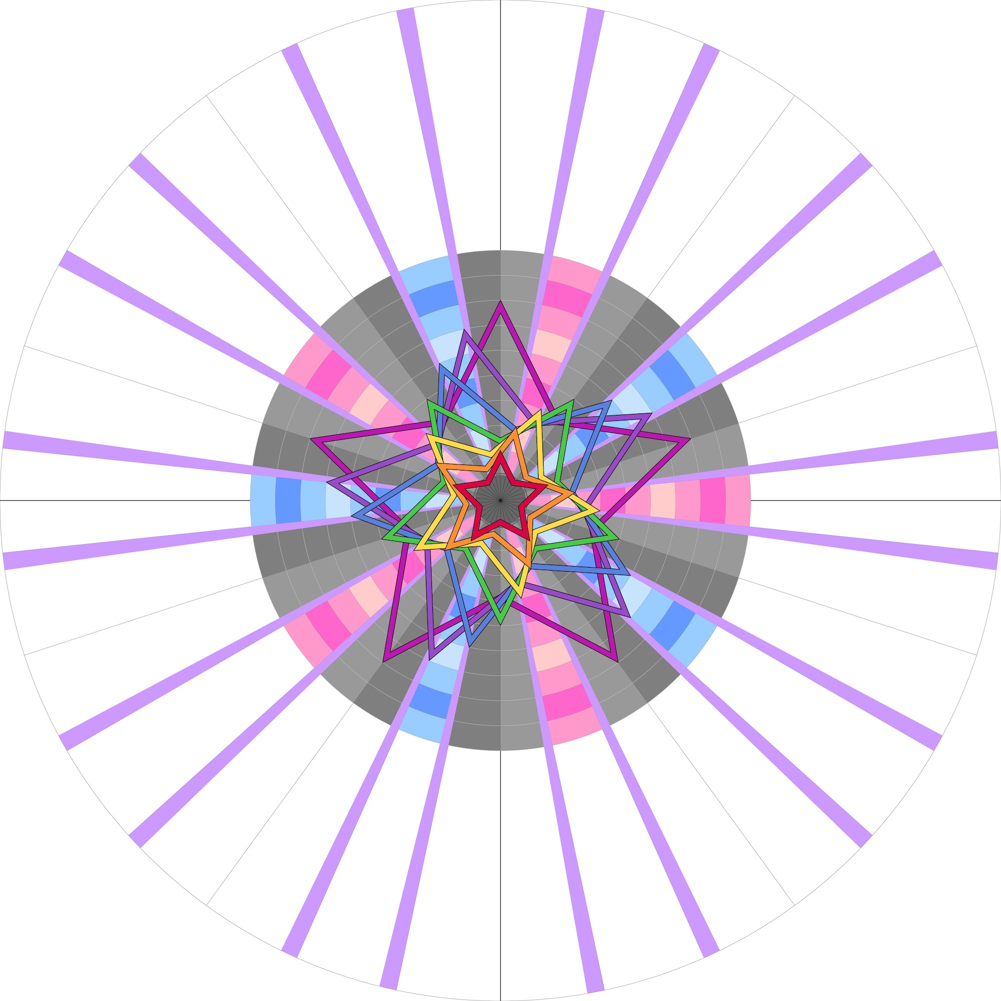
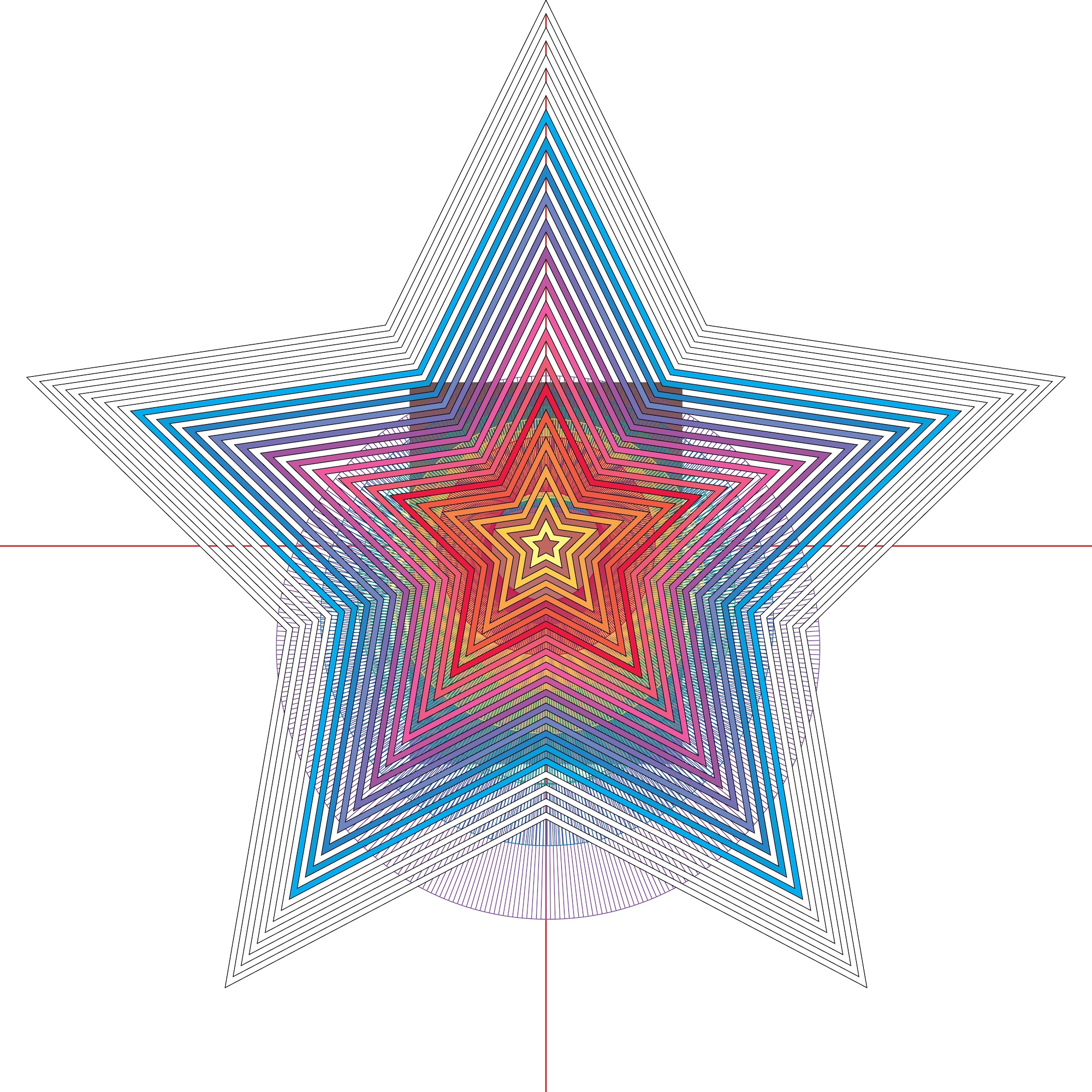
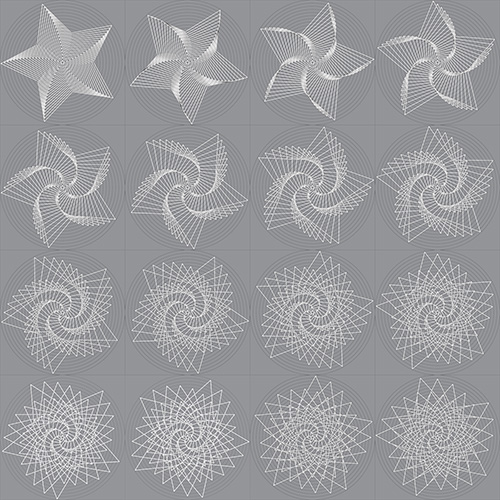
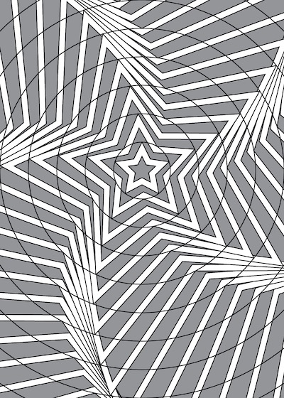
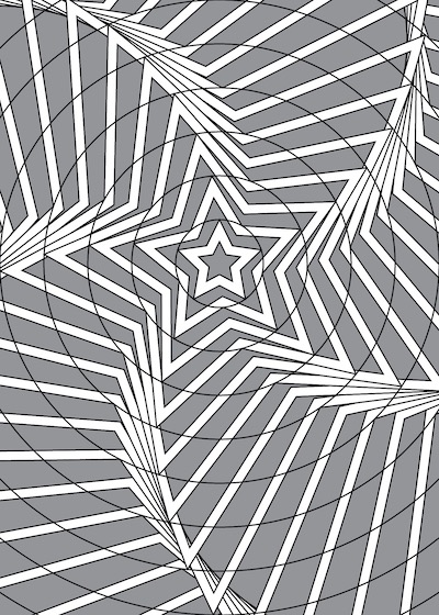
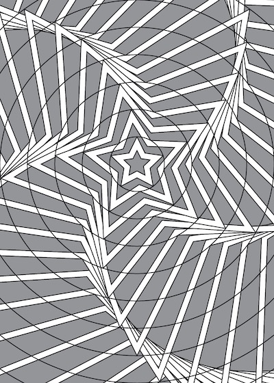
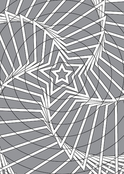
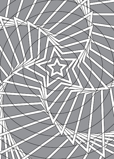
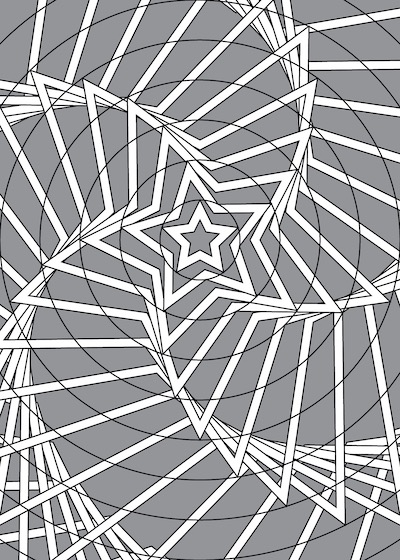
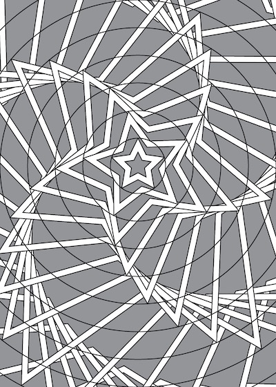
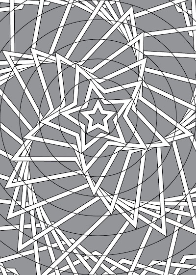
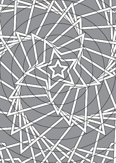
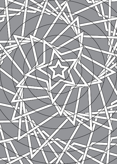
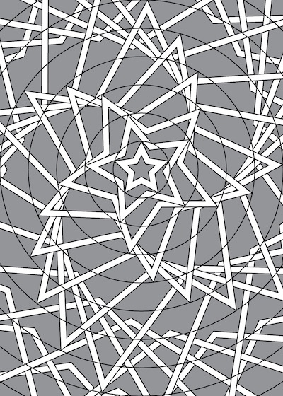
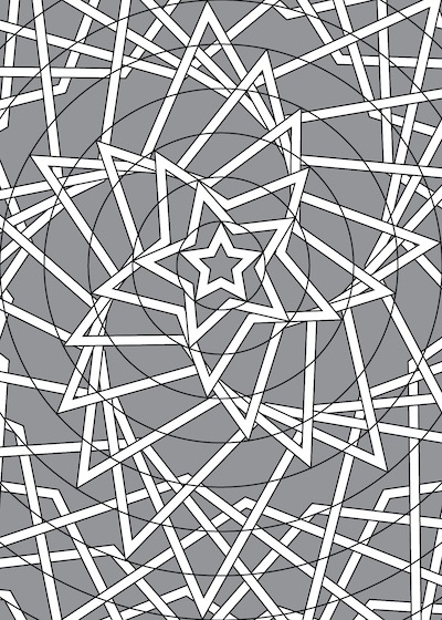
1. Rotation Arrays Ranging From 1 to 16 Degrees
Once I realized that I’d be producing a series of tanglestars, I decided to create a sampler set showcasing different rotations. I could tell that interesting ripples would emerge as the stars twirl and overlap — but needed to understand the possible results in practice, not just theory.
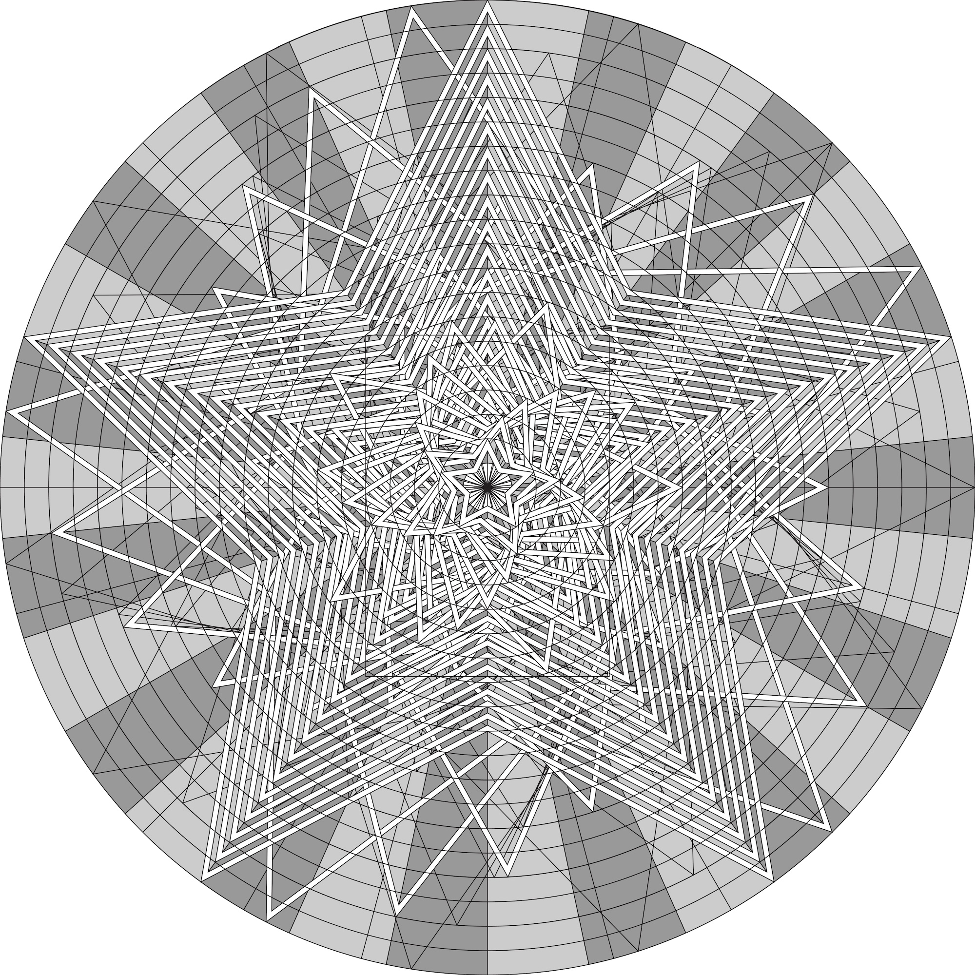
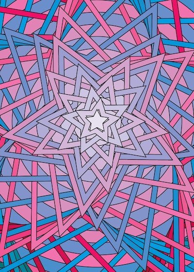
2. Initial Bare-Bones Test (16 Degrees)
Key measurements: The outline of the card is 5″ wide by 7″ tall. The stars share a center point, located 4″ up from the bottom of the card. Each star is comprised of both an interior and exterior outline. Each exterior outline is bounded by a circle. There are 20 circles (and stars), with outer radiuses that range from .5″ to 10″ in half-inch increments. The distance from a star’s center to its tips is exactly twice the distance from the center to its elbows. Vertices of a star’s interior outline are all placed .25″ inward from the matching exterior vertices. Neither interior nor exterior elbow vertices coincide with circles.
My initial series of rotation tests were saved as bare-bones Adobe Illustrator files. Reviewing them for this blog post, I was struck again by a desire to see these tanglestar samples animated. So I’ve revisited the images and made changes. I’ve added a gray background for contrast, and compiled them into an animated GIF.
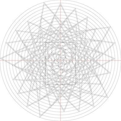
3. Tanglestar Rotation Sampler in Motion
The GIF was created using an old but powerful command-line app called ImageMagick. I further compressed it using the FreeConvert website. Unlike film or TV, animated GIFs measure frame rates in centiseconds. I’ve set the time delay between frames in this GIF to 15 centiseconds.
There’s still a chance that I may wind up doing more with the tanglestar concept, so I’m embedding a gallery of my sampler images below, for future reference.
Why did I stop at 16 degrees? Due to the way I constructed these shapes, I had to adjust the rotation for every individual star one at a time. With the zero-degree version as my default, and the centermost star remaining fixed, that’s 304 stars that needed to be turned. Patient, methodical work suits me — but you’ve got to draw the line somewhere!
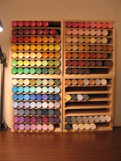
In 2007, I built myself some nice paint storage boxes. They hold a rainbow of cheap crafter’s paints. These are 2-ounce bottles of acrylic, Delta Ceramcoat brand. They cost about $1.60 each at JOANN Fabric and Craft Stores. I also keep a selection of fancy Golden brand acrylics on hand. But crafter’s paints remain my go-to choice. It’s just super convenient being able to pull out whatever color you want without having to blend.
1. my paint storage boxes, 2007
When I’m making birthday cards, one of the most irksome steps is doing color correction on the digital files. I try to get our laser printer to match the original painting as best I can. But I’ve learned it’s best to think of the prints as independent pieces of art. They’re derivative of the original, but allowed to be different — so long as I like them for their own merits.
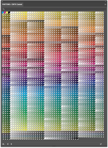
Switching to vector art this year was a game-changer. Working in Adobe Illustrator, I could use CMYK colors right from the start. By printing out a reference chart of swatches, I could select which colors I wanted to use with real certainty about how they’d appear on paper.
Like with my array of acrylics, I craved a digital paintbox to put the rainbow at my fingertips.
2. Adobe Illustrator CMYK Swatches
Unfortunately, I find Illustrator’s built-in CMYK swatches really difficult to use. The sheer number of swatches is overwhelming. My eye can’t easily tell the difference between similar groupings. And they’re not arranged in an order that I find intuitive.
So, I decided to create my own paintbox.
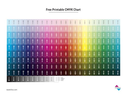
3. Free Printable CMYK Chart from swatchos.com
Researching online, I stumbled upon this really useful Free CYMK Chart, which is available as a printable PDF download. What I like most is how it provides the numerical codes for each color. This, more than anything else, helped me understand how each color swatch is built from different percentages of cyan, magenta, yellow, and black.
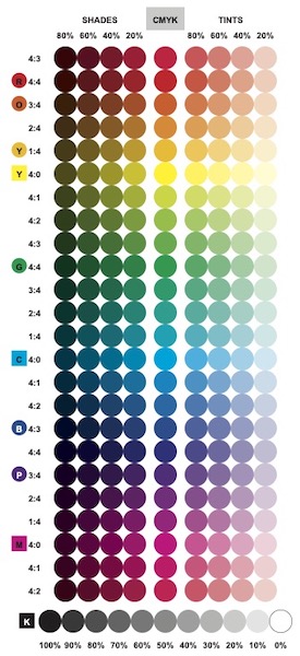
4. Sven’s Digital Paintbox – Basic
I built my personalized set of color swatches in Adobe Illustrator. I wanted the swatches to be round, like the bottoms of the bottles in my physical paint set. I put the colors in rainbow order: ROYGBV, with red at the top, and magenta as an afterthought to violet. I typed in all the color codes by hand, replicating numbers from the Swatchos chart.
The center column represents color mixes at 100% saturation, without any black. Swatches to the right (“tints”) have lower color saturation, allowing more paper to show through. Swatches to the left (“shades”) are darkened by the addition of black toner.
Ratios marked on the far left represent the mix of cyan, magenta, and yellow. For example, spring green is four parts yellow to one part cyan (4:1). Royal purple is three parts cyan to four parts magenta (3:4). I think I could make the chart clearer in a future draft… I imagine adding vertical color bars next to the ratios, to show where C, M, & Y each begin, end, and overlap.
Rows with pure cyan, magenta, or yellow are labeled with colored squares. Human vision is a bit subjective — so I also added colored circles to mark the rows where I personally see true red, orange, yellow, green, blue, and purple.
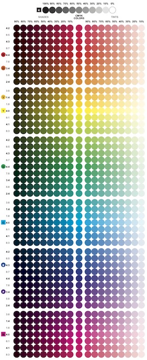
5. Sven’s Digital Paintbox – Expanded
While doing color correction in the past, I’ve noticed a few quirks about our printer. This exercise helped me crystalize those observations. Yellow is the weakest toner, and is easily overwhelmed by the addition of other colors. Red, on the other hand, dominates and seems to be overrepresented. And, it’s hard to get either a good turquoise or orange from CMYK.
Wanting finer gradations — particularly on either side of true yellow — I set about making an expanded paintbox… So many more color codes to type in!
In the process, I discovered a curious optical illusion. I don’t know about you, but if I stare at that grid of colored dots, it only takes seconds for them all to turn black — with just a few shades of gray on the right. Probably the chemicals in my eyes’ rods and cones get spent? I don’t know.
Anyway, now I keep print-outs of both charts nearby while I’m working in Illustrator. I’m careful to select my “paints” from paper rather than screen. In practice, it turns out that my basic digital paintbox is plenty, most of the time. It’s only when I’m specifically wanting an “in-between” color that I turn to the expanded paintbox — or if I want to build a sequence of colors that shifts more gradually.
This will be our fifteenth year of sending out birthday cards that feature original art. I needed some change in order to keep myself interested. So, this time around I set aside my paintbrush and explored making vector artwork. The basic DNA for all these designs came from playing with one of last year’s cards, Public Access Xanadu: 1980 Timeslip Broadcast.
1. Winter Tanglestar
2. Bramble Star Fever Flowers
3. Nonbinary Star System
4. And All Around Me, My Garden of Stars
(Title inspired by the song Garden of Stars by Brian Eno, from the album FOREVERANDEVERNOMORE.)
From 2009 through 2022, I completed fourteen seasons of birthday card paintings. But I confess, this fall I had some trouble mustering enthusiasm for another round.
The idea to do new art using Adobe Illustrator was intriguing. I’m still a novice with the software, and enjoy learning things. Also, it could be a step toward turning card art into animation. But I know friends really like the hand-painted designs; a few have kept collections of all the ones I’ve sent. I worry that digital art won’t carry the same emotional weight.
Before diving in with both feet, I decided to try a hybrid: making my underlying geometry in Illustrator, then coloring and embellishing it with traditional paints.
1. Coloring Book Blank
“Hybrid” and “geometry” sound fancy. But there’s no way around it…
This looks like a coloring book.
2. Test Painting (“Daytime Moon?”)
I explored a couple of different approaches, trying to obscure the machine-precise stars, circles, and rays. Crosshatching was promising. And it seemed like color gradients might be helping. I wouldn’t send this experiment to someone as a birthday card — but as a piece of ephemera, I kind of like the mix-and-match aesthetic.
After a couple hours, I set the test aside.
This coloring book concept doesn’t seem like a good basis for a series. Even if crosshatching and gradients panned out, wouldn’t I need to go back into Illustrator to build additional geometries? I suppose I could just decorate this one design in different color schemes — but that seems pretty tedious.
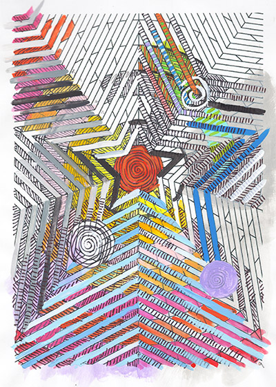
3. Illustrator Improv
Having now built concentric stars for both Public Access Xanadu and the coloring book experiment, I felt ready to try my first real improvisation in Illustrator.
I try to treat birthday card art like visual jazz. I like how the 5×7″ picture frame can usually be filled in a single sitting… Letting the colors and forms reveal themselves moment-by-moment, with basically no advance planning.
This first improv barely merits the name. Mostly, I just added colors to the recycled stars. Plus repetitions in the background of a single element at different scales. But, oh, the colors! So rich! And there’s proof of concept here that I can build complexity. I know I can do better — but in a pinch, I’d be willing to put this image in an envelope.
Decision made. I’ll gamble on something unfamiliar but exciting. The next round of cards are going to use vector art.
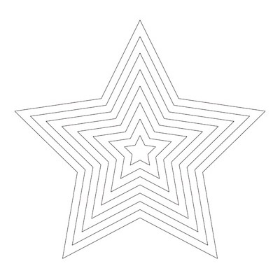
How do you draw a star shape? I used to break out a compass, ruler, and protractor every time. Very fussy. Last year, I finally realized I could use Adobe Illustrator to make a template: stars in different sizes that I could cut out and trace as needed.
2. Star Template
Even with this template, my painting titled “Public Access Xanadu: 1980 Timeslip Broadcast” took long time to make. It’s my least favorite design from the batch, but ate up the most hours. Every one of those straight lines had to be carefully paralleled with my brush, acrylic dabbed into countless tiny angles.
3. Public Access Xanadu: 1980 Timeslip Broadcast
Mind drifting while in the painting-trance, I imagined these rainbow stars as neon animation at the start of some late night TV show from the 1980s. In my fantasy, a signal from that mysterious broadcast slips through a rip in time… And some lone insomniac, flipping through channels in a darkened apartment, accidentally receives an impossible message from another era.
I like it when stories come to me while I work. And I like giving my paintings titles that provoke curiosity and imagination.
4. Xanadu as Vector Art
Still, after completing Xanadu, I had to ask myself: Why did I do that in paint?
I think viewers attribute special value to things that have been hand-painted. But precise geometry can be accomplished much more easily with a computer. I’d taken a first step in that direction by making the star template. And my neon fantasy really made me want to see this particular design in motion. So, as an exercise, I decided to make a reproduction using vector art.
The vector version of Xanadu is faithful. But inspiring? Not so much.
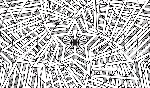
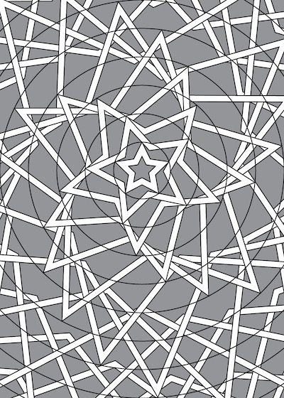
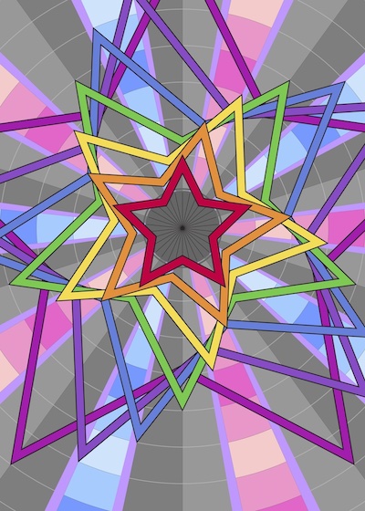
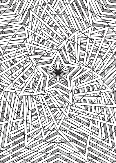
5. Underneath Xanadu: The Tanglestar
However, what I discovered underneath Xanadu was exciting!
At some point, I turned off visibility for the top layers of the composition. Underneath, I found that all my developmental drafts had quietly piled up into a chaotic tangle. Compelling. And not something I could have ever conceived of, had I been working in paint.
This accidental composition made me wonder: What if I tried doing all my greeting cards for 2023 in Illustrator?
I started creating hand-painted birthday cards for friends back in 2009.
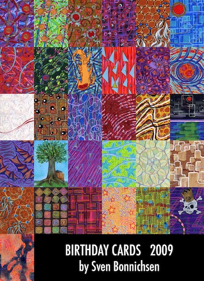
Making lots of small, single-sitting paintings was a great exercise. But sending original art to every individual was unsustainable. The following year, I switched over to scanning my paintings and making reproductions with our home office color laser printer.
Typically now, I do five designs each year. That allows me to send a different painting to all the members of the largest family on my mailing list — and have one more, set aside for New Year’s cards. Here are the designs that went out during 2022: