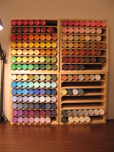
In 2007, I built myself some nice paint storage boxes. They hold a rainbow of cheap crafter’s paints. These are 2-ounce bottles of acrylic, Delta Ceramcoat brand. They cost about $1.60 each at JOANN Fabric and Craft Stores. I also keep a selection of fancy Golden brand acrylics on hand. But crafter’s paints remain my go-to choice. It’s just super convenient being able to pull out whatever color you want without having to blend.
When I’m making birthday cards, one of the most irksome steps is doing color correction on the digital files. I try to get our laser printer to match the original painting as best I can. But I’ve learned it’s best to think of the prints as independent pieces of art. They’re derivative of the original, but allowed to be different — so long as I like them for their own merits.
Switching to vector art this year was a game-changer. Working in Adobe Illustrator, I could use CMYK colors right from the start. By printing out a reference chart of swatches, I could select which colors I wanted to use with real certainty about how they’d appear on paper.
Like with my array of acrylics, I craved a digital paintbox to put the rainbow at my fingertips.
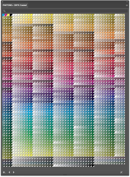
Unfortunately, I find Illustrator’s built-in CMYK swatches really difficult to use. The sheer number of swatches is overwhelming. My eye can’t easily tell the difference between similar groupings. And they’re not arranged in an order that I find intuitive.
So, I decided to create my own paintbox.
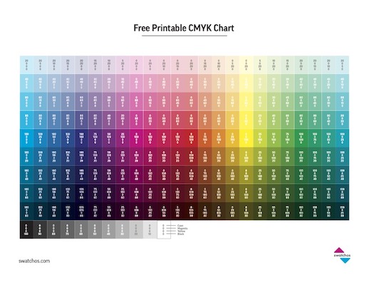
Researching online, I stumbled upon this really useful Free CYMK Chart, which is available as a printable PDF download. What I like most is how it provides the numerical codes for each color. This, more than anything else, helped me understand how each color swatch is built from different percentages of cyan, magenta, yellow, and black.
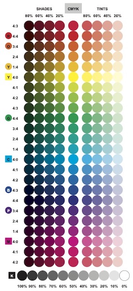
I built my personalized set of color swatches in Adobe Illustrator. I wanted the swatches to be round, like the bottoms of the bottles in my physical paint set. I put the colors in rainbow order: ROYGBV, with red at the top, and magenta as an afterthought to violet. I typed in all the color codes by hand, replicating numbers from the Swatchos chart.
The center column represents color mixes at 100% saturation, without any black. Swatches to the right (“tints”) have lower color saturation, allowing more paper to show through. Swatches to the left (“shades”) are darkened by the addition of black toner.
Ratios marked on the far left represent the mix of cyan, magenta, and yellow. For example, spring green is four parts yellow to one part cyan (4:1). Royal purple is three parts cyan to four parts magenta (3:4). I think I could make the chart clearer in a future draft… I imagine adding vertical color bars next to the ratios, to show where C, M, & Y each begin, end, and overlap.
Rows with pure cyan, magenta, or yellow are labeled with colored squares. Human vision is a bit subjective — so I also added colored circles to mark the rows where I personally see true red, orange, yellow, green, blue, and purple.
While doing color correction in the past, I’ve noticed a few quirks about our printer. This exercise helped me crystalize those observations. Yellow is the weakest toner, and is easily overwhelmed by the addition of other colors. Red, on the other hand, dominates and seems to be overrepresented. And, it’s hard to get either a good turquoise or orange from CMYK.
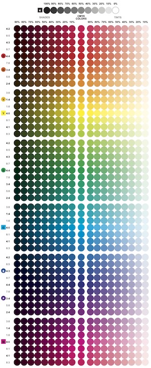
Wanting finer gradations — particularly on either side of true yellow — I set about making an expanded paintbox… So many more color codes to type in!
In the process, I discovered a curious optical illusion. I don’t know about you, but if I stare at that grid of colored dots, it only takes seconds for them all to turn black — with just a few shades of gray on the right. Probably the chemicals in my eyes’ rods and cones get spent? I don’t know.
Anyway, now I keep print-outs of both charts nearby while I’m working in Illustrator. I’m careful to select my “paints” from paper rather than screen. In practice, it turns out that my basic digital paintbox is plenty, most of the time. It’s only when I’m specifically wanting an “in-between” color that I turn to the expanded paintbox — or if I want to build a sequence of colors that shifts more gradually.