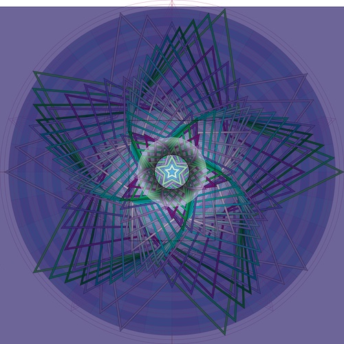
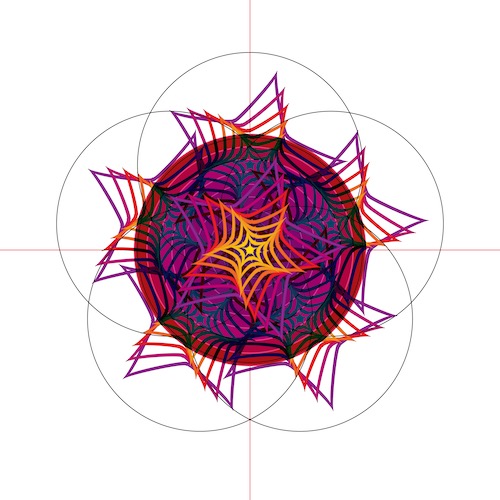
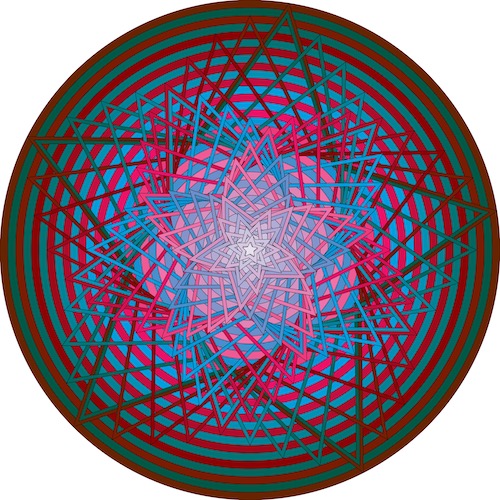
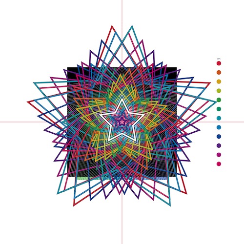
All of my greeting card images fill the 5×7″ picture frame entirely. It’s as if you’re inside a house, looking out through a window. You intuitively know there’s more to the landscape than just the small part that’s visible from where you’re standing.
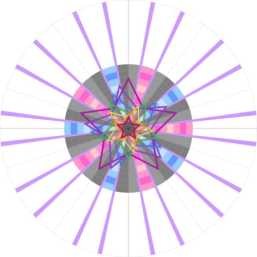
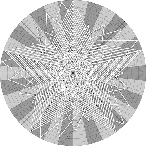
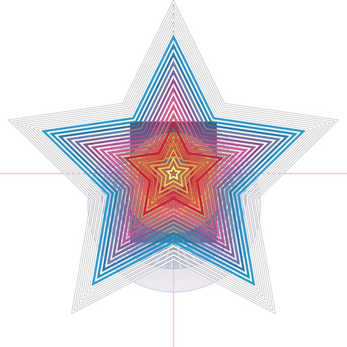
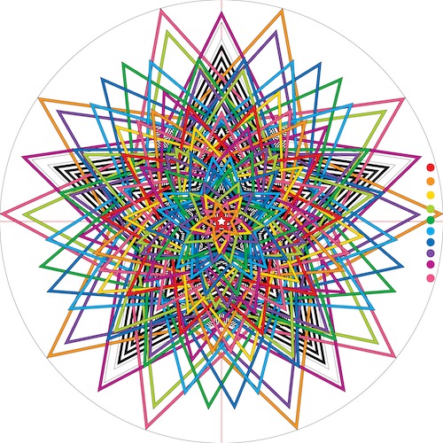
In order to achieve this effect, I deliberately construct more imagery than I need. Create a big canvas, frame a smaller section. Below, have a look at what lies outside the picture frame for this year’s cards.
(Click on images to see extra-large versions!)
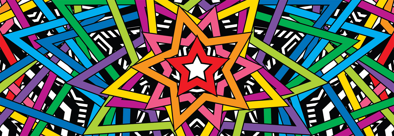
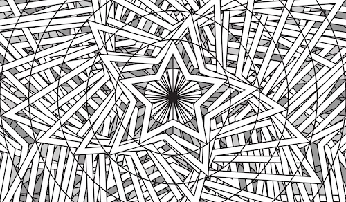
Building more imagery than I need leads to a very interesting possibility. I have the option to reframe my artwork. The frame doesn’t have to be 5×7. Instead, for instance, I could select an area with a 16:9 aspect ratio. That’s the frame shape we currently associate with television and cinema.
For years, I’ve wondered what my greeting cards would look like if they were translated into animation. By reframing this year’s designs to 16:9, I now have concept art that shows me much more clearly what animated versions might look like.
The fact that I made this year’s cards using vector art is also important. Regardless of what frame I use, animation made using acrylic paints would be extremely labor-intensive. But having begun in Adobe Illustrator, I can now import the shapes that I’ve constructed directly into Adobe After Effects.
The leap from concept art to animation suddenly looks very small indeed.
